

About the project
MOKA is a bakery-cafe located in the extreme south of Sweden. It has a young, femenine, modern, fun and elegant personality at the same time.
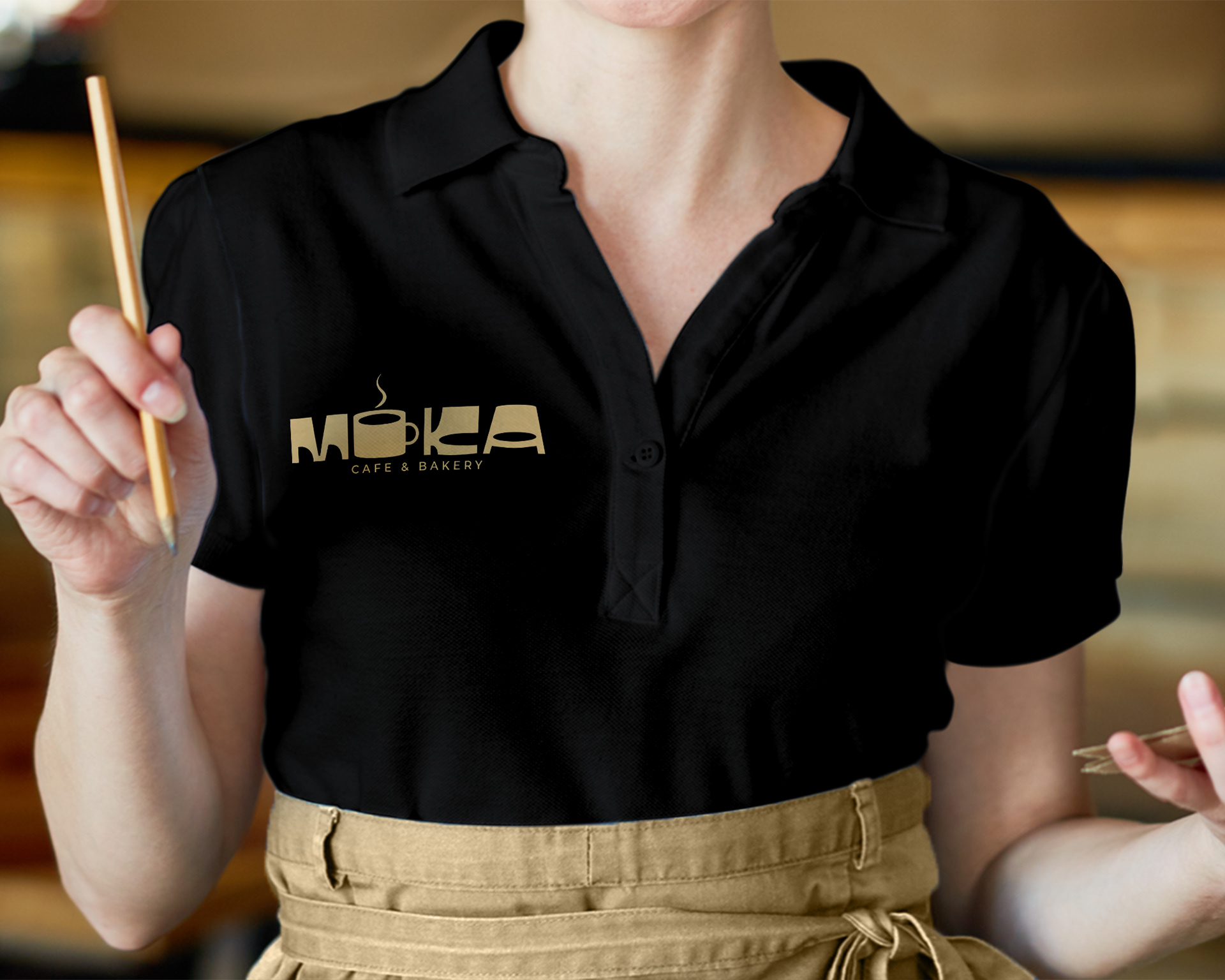
For the MOKA logo, a creative and fun concept was created through the similarity of shapes between the letter "o" and a cup of hot coffee. In the same way, a modern bold typeface was used, to achieve a modern, minimalist, feminine and elegant style.
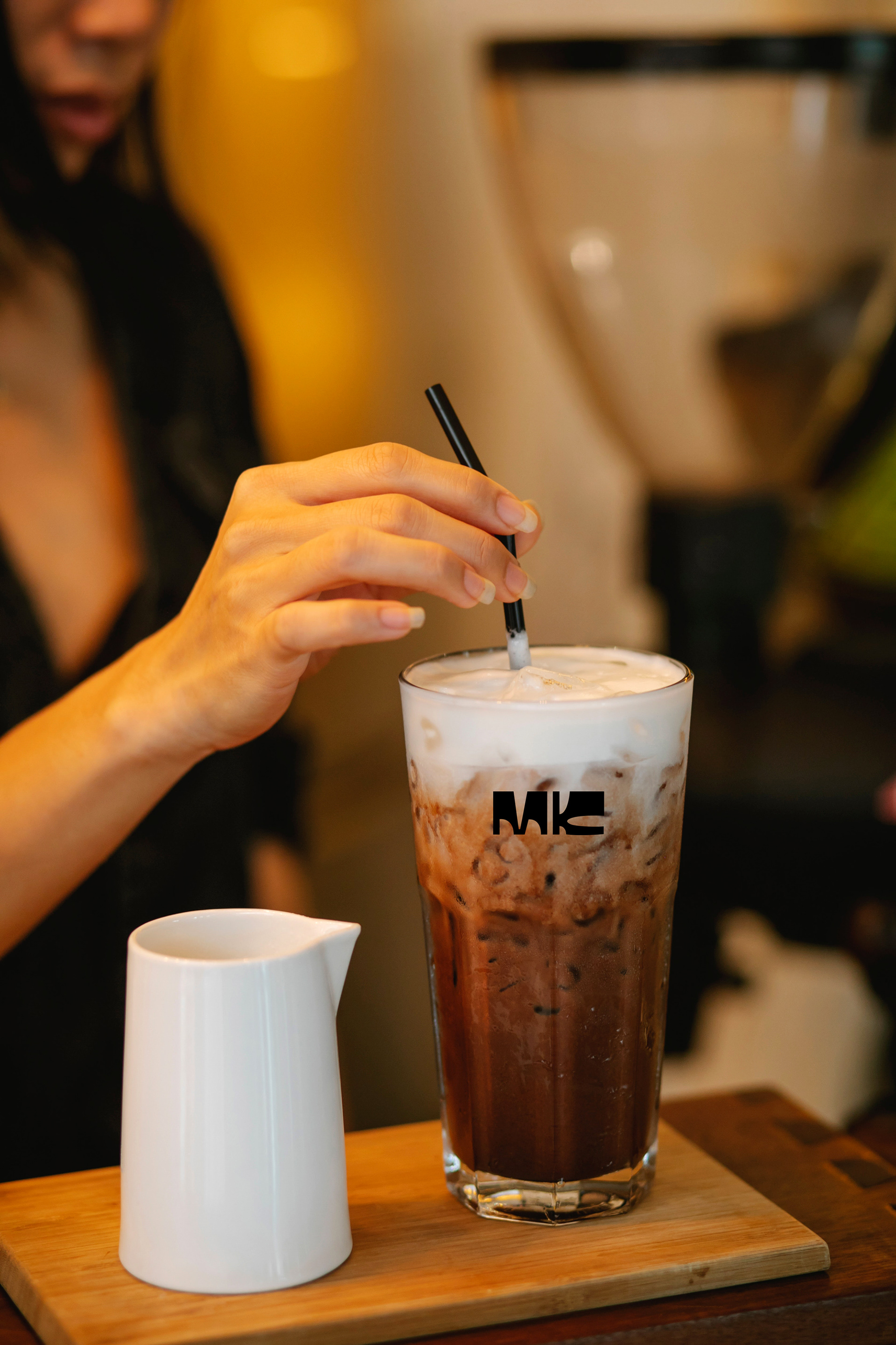
For the construction of the visual identity, a color palette based on the colors of coffee was used. Which was used in the elaboration of each of the pieces that make up the identity. I hope you like it.